
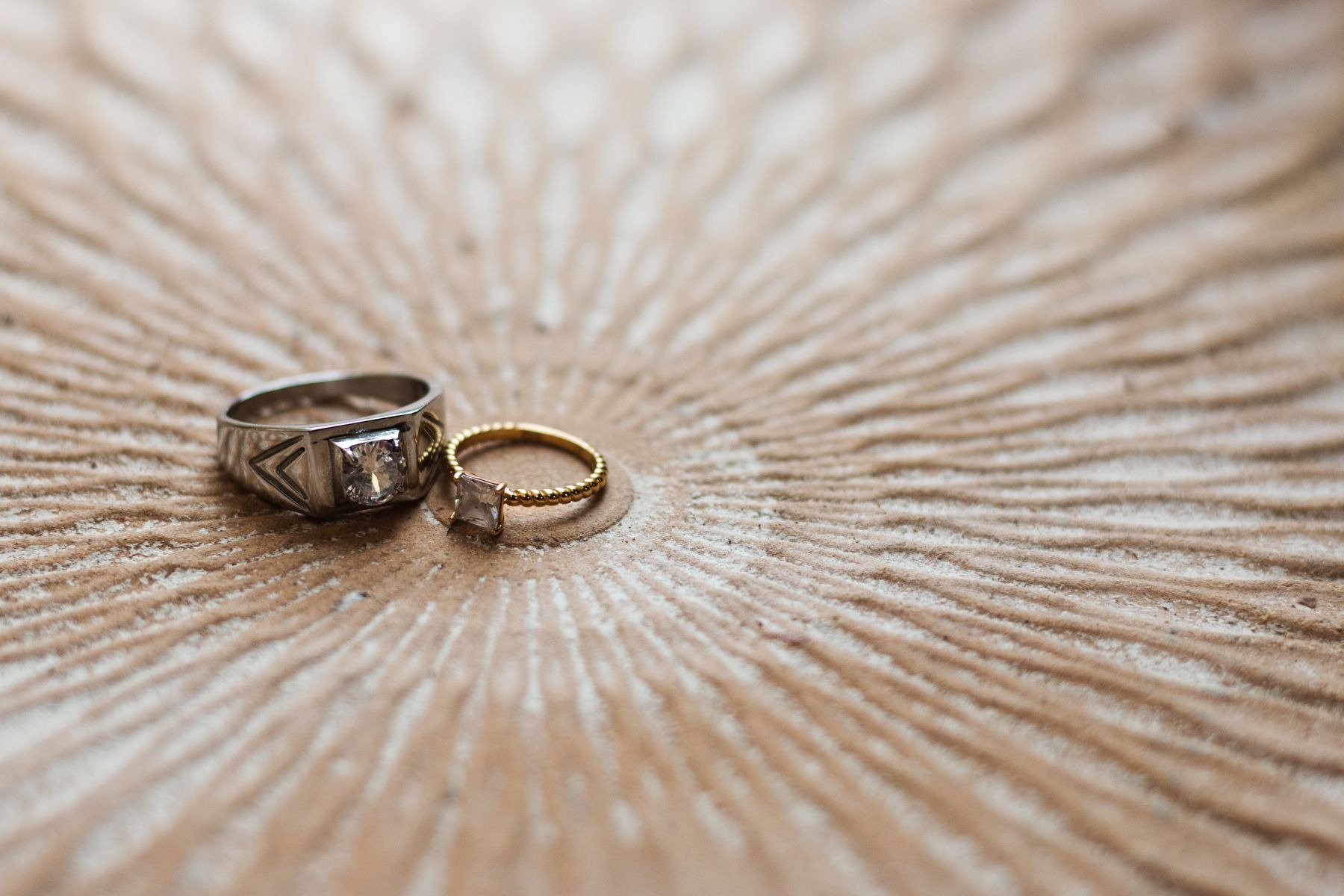
Mixed-metal jewelry looks intentional when the pieces share an understandable relationship. That relationship might be repeated color, similar scale, a common shape, or one two-tone piece connecting the rest. It does not require buying a matching collection or dividing every metal equally. In this guide, gold and silver describe visible colors rather than guaranteed metal composition. Material labels still matter when choosing jewelry, especially if you have known sensitivities, but styling begins with what the eye sees.
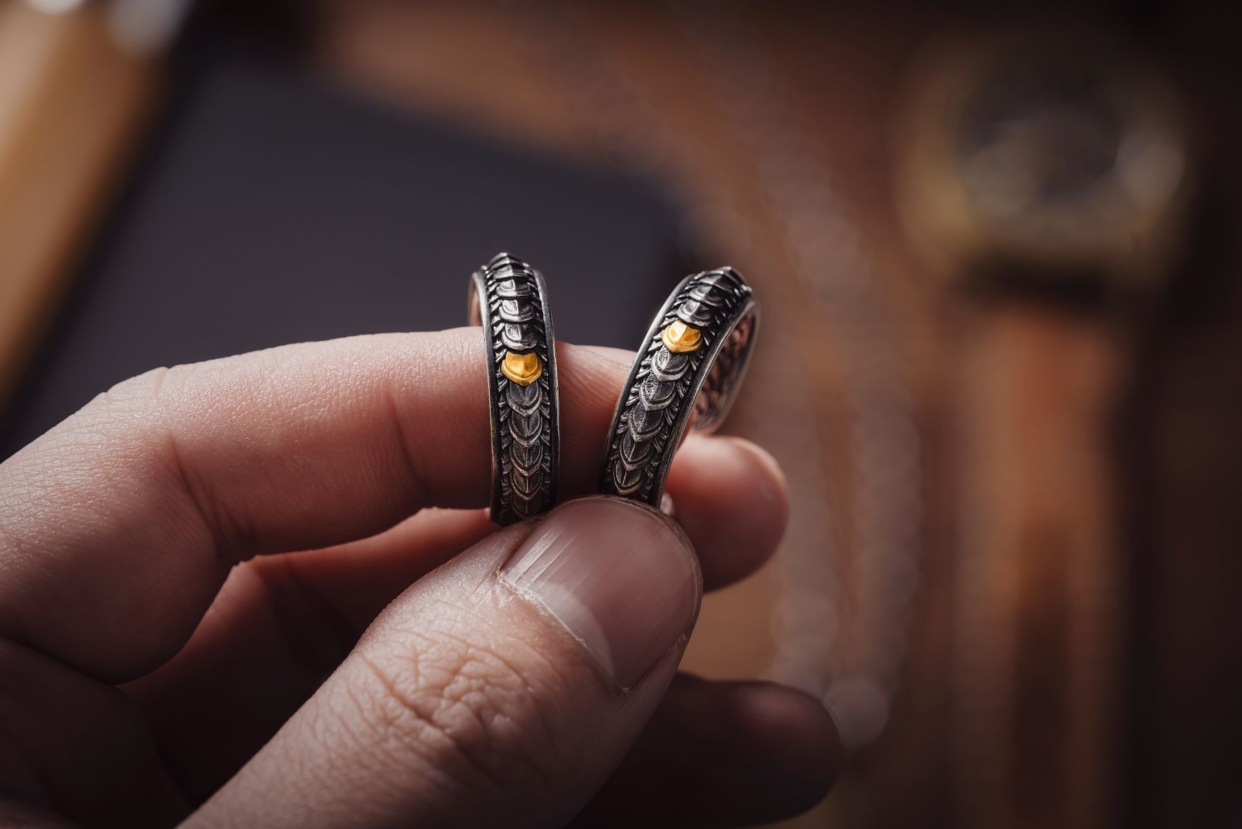
1. Choose the piece that gets first attention
Start with the item you actually want to wear: a pendant, substantial hoops, a watch, or a meaningful ring. Put it on before adding anything else. Its size, shine, and position will tell you how much space remains for supporting jewelry. A large polished silver pendant is already a strong focal point; small gold studs can accompany it without trying to become equally important.
If every piece is dramatic, mixed colors may not be the real problem. Remove one large item and assess the outfit again. Choosing a lead piece keeps the exercise about composition rather than accumulating enough jewelry to prove that the metals belong together. Sometimes one contrasting pair is all the outfit needs.
2. Use repetition without requiring symmetry
Repeating a metal color in a second place can make its presence feel deliberate. Gold hoops with a gold ring can frame a silver necklace between them. Alternatively, silver earrings and a silver watch can support a gold pendant. The pieces do not need identical finishes, and they do not need to sit at matching points on the body.
A useful starting exercise is one visually dominant color and a smaller amount of the other. This is not a mathematical ratio. A single broad silver cuff may occupy more visual space than several fine gold rings. Judge the amount you can actually see from normal conversational distance instead of counting pieces and assuming the totals explain the balance.
3. Connect shapes when colors differ
Shape can provide continuity across metals. Rounded gold hoops, a silver oval pendant, and a smooth gold band share a curved vocabulary. Geometric silver studs and a gold rectangular signet ring create a different, more angular relationship. This connection can be subtle; it works best when you can name the similarity without needing every item to be identical.
Try laying the pieces on a plain top before wearing them. If a highly decorative filigree necklace seems disconnected from a severe square cuff, decide whether you enjoy the contrast or want a quieter companion. Mixed metals do not demand uniformity, but a shared feature gives contrasting pieces an easier conversation. Color is only one part of that decision.
4. Compare finish and thickness together
Highly polished surfaces catch attention differently from brushed or softly textured ones. A broad polished gold bracelet can dominate several fine silver chains even when their colors are equally visible. If the result feels unbalanced, compare a narrower bracelet or reduce the number of competing reflections near it.
Thickness matters at close range too. A very fine chain beside a much heavier chain may disappear, making the combination look less deliberate than expected. Try separating them by length or wearing the fine chain alone with a contrasting ring instead. You can mix metals across the body without stacking them together. That approach is often easier when the pieces have very different construction or scale.
5. Let a two-tone piece help, but do not make it mandatory
A bracelet, ring, or watch containing both colors can act as a visible bridge. Put it on, then choose one supporting piece in each of its main colors. For example, a two-tone watch might accompany small silver hoops and a plain gold band. The watch supplies the link, so the other items can remain simple.
Do not buy a bridge piece merely because you think mixing is otherwise forbidden. Repetition, shape, and balanced placement can do the same visual work. Also look closely at the two-tone item itself: if one color is barely visible, it may not connect the rest as strongly as you imagine. Evaluate it as worn, not only enlarged in a product photograph.
6. Keep clothing hardware in perspective
A zip pull, belt buckle, or bag clasp does not automatically require matching jewelry. Consider how prominent it is. A small functional zip beneath a jacket can remain background detail, while a large polished buckle near the waist may become part of the composition. If the buckle is visually strong, let it repeat one jewelry color or keep the surrounding accessories restrained.
Try a navy shirt, silver necklace, gold hoops, and a brown belt with a modest gold-colored buckle. The repeated gold connects the outfit without turning every closure into a rule. If you swap to a decorative belt, reassess the necklace before changing all the jewelry. The issue may be competing focal points rather than incompatible colors.
7. Edit the combination at normal viewing distance
Step back from the mirror and look at the entire outfit. Jewelry that looks beautifully coordinated in a close-up can become a cluster of unrelated bright dots at a distance. Check whether there is a clear focal area and whether the second metal appears enough to feel chosen. Move one ring, remove one necklace, or simplify the earrings before adding another piece.
Keep a photograph of a combination you like with a familiar outfit. Note its actual logic: curved shapes, one bright focal piece, repeated warm metal, or a two-tone connector. That gives you a reusable method rather than a fixed set. The strongest mixed-metal styling reflects what you enjoy wearing while making the relationships easy to see.