
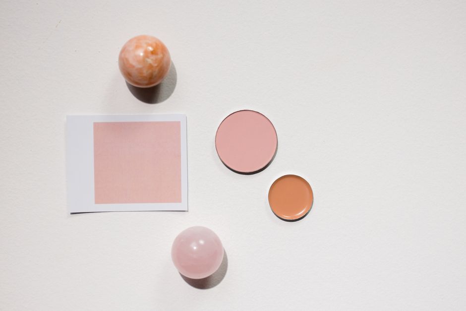
Peach blush can bring a little spring warmth to your face without asking you to rethink your whole makeup routine. The trick is choosing the version of peach that looks clear and lively against your skin. A delicate pink-peach, a golden apricot, and a deeper terracotta-peach can look surprisingly different once applied. If you have tried peach before and found it too orange, too pale, or barely visible, the color family may still suit you. You may simply need a different balance of pink and gold, a richer pigment, or a quieter finish.
Think of peach as a color family
Peach sits between pink and orange, but blush shades can lean strongly toward either side. Some have a milky base that makes them look pastel. Others have a brown or red undertone that gives them more depth. Looking beyond the shade name helps you choose something that makes sense on your face.
A compact labeled soft peach might look almost pink on one person and distinctly orange on another. Your natural skin color, any visible redness, and the makeup underneath all influence the result. Treat the name as a starting point and judge the color after it has been blended out.
- Pink-peach: A useful starting point if you like rosy cheeks but want a warmer spring shade.
- Apricot: A more golden direction for a sunny, softly warm effect.
- Coral-peach: A brighter option when muted shades seem to disappear.
- Terracotta-peach: A deeper, earthier choice when pale peach leaves a chalky cast.
Choose depth before worrying about undertone
It is easy to become absorbed in whether your skin is warm, cool, or neutral. Those clues can help, but first ask whether the blush has enough depth to show up naturally. A shade that is much lighter than your skin can leave a pale film, even if its undertone sounds perfect.
For fair and light skin
Look for a peach that blends into a gentle wash rather than a strong orange stripe. Pink-peach often feels approachable if you usually wear rose shades. If your skin has a golden quality, a light apricot may look especially harmonious. Highly pigmented colors can also work; choose them only if you enjoy controlling a very small amount.
For medium and tan skin
Mid-depth apricot, warm peach, and peach-coral are worth comparing. A very pale pastel may be less useful than a shade that looks slightly stronger in the pan. If a soft peach disappears as you blend, try more color depth before assuming you need to apply several extra layers.
For deep skin
Consider rich coral-peach, burnt apricot, or terracotta with a clear peach warmth. Check the blended edge carefully: you want color that remains visible without a grayish or whitish veil. A vivid shade in the packaging may create a beautifully gentle result on your cheeks, so do not judge intensity from the compact alone.
Use undertone as a guide, not a rule
If golden peach looks too orange on you, move toward pink-peach. If pink-peach looks disconnected from your complexion, compare it with a more golden apricot. For olive skin, a peach with some depth may work better than a heavily whitened pastel, though the best balance will depend on your particular coloring.
Visible redness can make color comparisons confusing. Try the blush over the kind of base you normally wear, whether that is bare skin, a sheer tint, or foundation. You are choosing a shade for your everyday face, so there is little value in assessing it over an unfamiliar, much heavier base.
Read the finish as carefully as the shade
Two nearly identical peaches can give very different impressions if one is matte and the other sparkles. For an easy spring look, start by deciding how much reflection you actually want on your cheeks. Freshness can come from a flattering color alone; it does not require shimmer.
A softly matte or satin finish can offer color without an obvious reflective layer. A luminous finish may be lovely if you enjoy sheen, but check whether you can see separate glitter particles. On skin with visible pores or fine lines, pronounced sparkle may draw attention to texture more than you would like.
If your skin has become drier with age, you might prefer a flexible cream or liquid. Powder can still be a good choice if it sits comfortably on your usual base. Formula labels are less useful than how the product actually looks and feels after settling. Avoid choosing a texture simply because it is marketed toward your age group.
Make a useful shade comparison
A hand swatch can reveal whether a blush is pink, golden, or shimmery, but it cannot fully predict the effect on your face. Where hygienic sampling is available, compare a small number of shades using clean, single-use applicators. Avoid applying shared testers directly to your skin.
- Compare a pink-leaning peach with a golden peach at a similar depth.
- Blend each swatch until the edges are soft, rather than judging a thick stripe.
- Look for a pale residue, obvious sparkle, or an unwanted orange tone.
- Check the color in indirect daylight if possible, alongside your usual makeup.
- Step back from the mirror to judge the overall balance of your face.
For a new formula, patch test according to its instructions before regular use. Stop using it if irritation develops, and see a dermatologist for persistent skin problems. A flattering shade should also be comfortable to wear.
Let the rest of your makeup help you decide
Peach blush does not need matching peach lipstick. If you usually wear a cool rose lip, a pink-peach cheek may connect easily with it. If your favorite lip colors are warm nude or soft brown, apricot or earthy peach may feel more at home. Use what you already enjoy as a reference.
Keep your eye makeup familiar while assessing a new cheek shade. Soft brown liner, understated shadow, or your usual mascara gives you a stable background for comparison. Changing every color at once makes it harder to tell whether the blush itself is working.
Recognize the peach you will actually wear
The right peach should be easy to recognize once you see it blended: your cheeks have warmth, the edges sit comfortably against your skin, and you like the effect from a normal conversational distance. It need not be invisible, and it need not imitate a natural flush exactly. There is room for a little deliberate color.
Before choosing, picture it with a plain spring shirt and the lipstick you reach for most often. If it brings those familiar pieces together, you have found a useful addition. A peach blush earns its place through that everyday ease: a shade you understand, a finish you enjoy, and enough warmth to make your usual makeup feel refreshed.