
Navy, cream, and green offer plenty of variation without requiring a complicated print. Navy can provide a dark anchor, cream can separate darker pieces, and green can range from a quiet olive to a vivid accent. The combination works best when you decide where each color belongs rather than distributing all three equally by habit. Start with the garments you already own and let their size, texture, and placement guide the balance.
Compare the actual shades together
Place the clothes beside one another in daylight. Navy can look nearly black or noticeably blue; cream can lean yellow, gray, or close to white. Green covers an especially broad range, including olive, sage, forest, and clear grass tones. These differences matter more than the color names printed on a product page.
Try one green against the navy and cream before adding accessories. Olive with a warm cream produces a softer, earthier impression, while forest green and a clearer cream can feel more defined. These are visual descriptions, not rules about who may wear which shade. If one garment seems disconnected, compare another tone in the same color family rather than abandoning the whole combination.
Arrangement one: navy trousers, cream top, green layer
Use navy straight trousers as the base, add a cream fine-knit top, and finish with an olive jacket. The cream creates a clear center between the darker lower half and the green outer layer. Brown flats or simple navy shoes keep the footwear from becoming a fourth dominant color. Let the jacket hang open initially so all three colors remain visible.
Check the lengths as well as the palette. If the cream top hangs far below a short jacket, it creates an extra band at the hip. That can work, but a small tuck or a shorter top may produce a cleaner transition. If the jacket is very bulky, keep the top smooth so the color contrast remains easy to read instead of disappearing into several folds.
Arrangement two: cream trousers with a navy-green upper half
Cream trousers make the lower half brighter and more prominent. Try a navy crewneck with a forest-green overshirt, or a green blouse under a navy cardigan. Keep the trousers comfortable and appropriately opaque with your intended underlayers, since pale fabric can reveal outlines that darker fabric conceals. Judge this in ordinary light before treating the color combination as finished.
Choose shoes according to the contrast you want. Navy shoes connect to the top and create a dark endpoint. Pale shoes continue the lighter lower section, while brown introduces a small additional tone. Do not add a matching green belt automatically; the green blouse or overshirt may already supply enough color. One strong green area can be more coherent than several tiny repeats.
Arrangement three: a navy dress with two controlled additions
A navy dress can carry the largest color area, leaving cream and green to play smaller roles. Try a cream cardigan and a green bag, or a green cardigan with cream shoes. Choose one arrangement rather than wearing every available accessory in both colors. The dress remains the anchor while the added pieces create a clear hierarchy.
Look at how much of the dress stays visible when the cardigan closes. If the knit covers most of the upper half, its color becomes more dominant than it appeared on the hanger. That is not a problem, but it changes the balance. A narrow green scarf near the neckline is a different kind of accent from a full green cardigan; use the scale that suits the effect you want.
Arrangement four: a green skirt with a navy frame
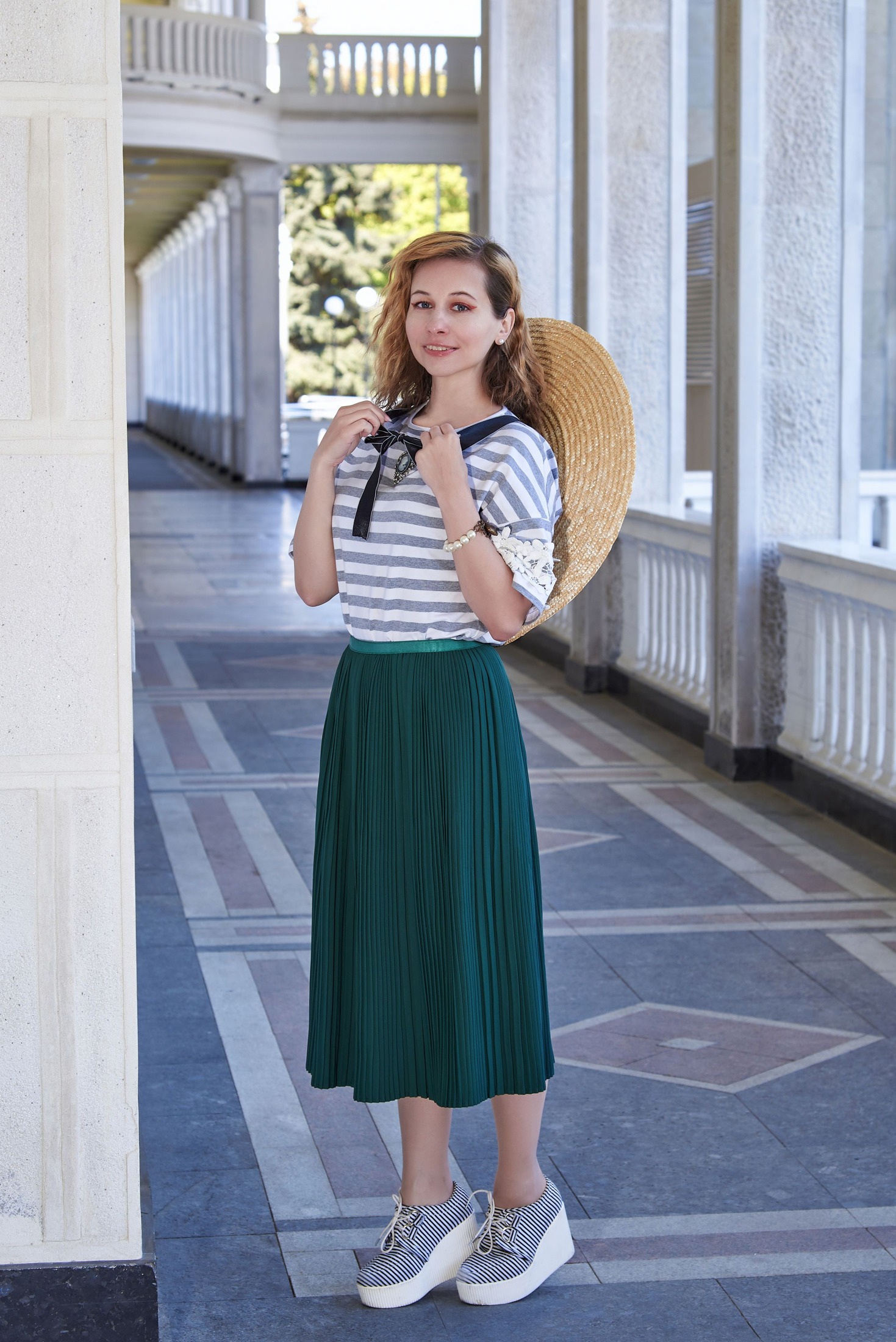
Give green the main role with an olive or forest midi skirt, a cream T-shirt, and a navy jacket. The cream separates the two darker colors at the center. Alternatively, a navy top with a cream open shirt can create a softer frame. Keep the skirt plain if you want to explore the color relationship without introducing print at the same time.
Check the lower half with the actual footwear. A substantial dark shoe can make a fluid green skirt feel more grounded, while a pale flat creates a lighter endpoint. If the skirt is full, compare a compact jacket with a longer one. The palette does not remove the need for proportion checks; color and silhouette work together, and either can be the reason an outfit feels unresolved.
Use texture and small details to refine the balance
Three solid colors do not have to mean three flat surfaces. A cream ribbed knit, navy twill trousers, and a smooth green bag create variation without a print. Keep highly textured garments from competing at every level: if the top is chunky and the jacket heavily detailed, a simpler lower half can give the eye somewhere quieter to rest.
Metal hardware and visible socks also contribute to the finished palette. They do not need to match perfectly, but notice when several small details introduce strong extra contrasts. A patterned scarf containing navy, cream, and green can connect the outfit, yet it is optional. Avoid buying a patterned accessory solely to justify colors that already look good together without it.
Choose the color that leads, then stop adding
Stand back from the mirror and name the first color area you notice. If it is not the one you wanted to lead, change the size or placement of an item. A large cream tote can become more prominent than a small green top detail; a dark coat can conceal most of the palette. Assess the outfit both with and without the outer layer.
Save two combinations that fit your routine, such as navy trousers with a cream top and olive jacket, plus a navy dress with a green cardigan. Those provide different distributions of the same colors. The practical goal is not a mathematical ratio. It is a clear arrangement in which each color has a role and no extra accessory is needed to explain the outfit.